
ORC Week 2: The Design Plan
There are so many moving parts in updating a kitchen. Luckily our layout isn’t changing, I’m just doing a much needed update with new countertops, a tile backsplash, sink, faucet, paint and Roman shades - lots of updating. While we are getting a new stove, we are keeping our existing microwave. And speaking of microwaves - I looked at doing a hood and had it priced out but decided against it. I would have to lose the cabinets above the microwave and there is no guarantee that they would be able to match the moldings or not damage them in the process of removing the cabinet. Too much could go wrong and I use all my cabinets.
We also considered open shelving, but I don’t need anything else to clean or dust - no thank you. This week we are looking at countertops because they will dictate the backsplash for me and will be the largest most expensive elements in the room. I’m thrilled to be getting rid of the granite countertop. They served us well and I took care of sealing them every year, but what I hated most about them was I could never keep them clean. I couldn’t find the sticky spots and crumbs would hide from me all the time. I had to stand back at an angle and look for the spots I missed. I won’t miss doing that anymore! We are going with crisp clean white quartz. I just have to decide if I go solid white or something with movement or a pattern. Daren is giving me carte blanche on selecting everything, in his words “you are the designer, do your thing.”
MY DESIGN PROCESS
I can see the design in my head clear as day, but I also like to start with an inspiration image. I knew I wanted black cabinets, so I searched Pinterest for inspiration (like I tell my clients). I came across this kitchen design by Nicole Hollis Studio and she nailed it!

Inspiration Image: Designed by Nicole Hollis Studio
This image serves as my inspiration - meaning I will use some elements from this design in my own kitchen without copying the design. Let’s examine what I will be pulling from Nicole’s design into my own kitchen:
My cabinets will be painted black and I will have the 3 cabinets above my stove fitted for glass fronts like the inspiration photo.
I will paint the inside of the 3 cabinets with new glass fronts white as in the inspiration photo.
I will use the cabinets above my stove to display items, taking a cue from the inspiration photo.
How I will make it my own design:
I will use brass knobs and pulls instead of black;
I will use a quartz countertop with less veining;
I will use a tile backsplash;
All my cabinets will be painted black. I did go black and forth with this quite a bit. I thought about black uppers and white lowers (like the inspiration photo) but decided on all black.
This is how I work with clients, pull what will work for you, your home, and your budget without copying the entire design. And just so we are are clear the “I” is a professional, not me doing these things.
KITCHEN FAUCET
The kitchen faucet can set the tone for the finished you decide to use. I wasn’t really sure what kind of faucet I wanted but when I saw this bridge faucet from Brizo - it stopped me dead in my scroll.


How sexy is this Litze® Kitchen Collection from Brizo? It melds together innovative engineering and artistry to strike a balance that is equally at home in modern, classic or urban industrial spaces. The luxe gold will beautifully pick-up all the other brass elements going into the kitchen. My new friends at Brizo were kind enough to sponsor this set.
KITCHEN ROMAN SHADE
Although the kitchen is going to be black, I of course wanted to play with pattern. So my must have for the kitchen was this fabric from our sponsor Calico for my custom roman shade. This pattern will hide all stains (which my current white one does not). It’s a graphite gray and will add some dimension to the black cabinets. Listen calico has so many great fabrics to chose from I spent hours on their website trying to narrowing down my options.

Calico Corners Eastly 50 Ink Fabric - Roman Shade Fabric
KITCHEN RUNNER
The roman shade fabric nicely picks up the same graphite/charcoal colors in the runner I selected from our sponsors Loloi from the Alice Collection by Chris Loves Julia .

KITCHEN STOOLS
To continue with our graphite, charcoal and gray scheme, I reached out to my friends at Ballard Designs for a pair of counter height stools for the kitchen. The Cornelia Leather Counter Stool was the perfect addition to the mix. It’s leather and easy to clean, has a generous seat, and the antique brass legs compliment all the brass elements going into the kitchen. I really love the classic and clean lines, they are truly timeless.
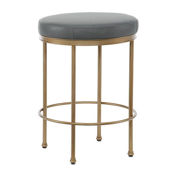
Ballard Designs Cornelia Leather Counter Stool - Kitchen Counter Stools
KITCHEN HARDWARE
Cabinet hardware is more than a way to open, close, and secure a space. It’s an integral part of a room’s design theme and I love the versatile design of the Brandt Knob by Emek in satin brass. This knob is the perfect bridge between the traditional elements of my cabinetry and the sleekness of painting them black. I paired the Brant Knob with the clean transitional elements of the Japser Pull in satin brass to complete the look.

Emtek Brandt Knob

Emtek Jasper Pull
It’s the details that make or break a design, so I also plan to update our pantry door hardware with Emek Select R-Bar Knurled Lever in a flat black finish. This little detail will tie nicely into the black cabinets.

Emek Select, R-Bar Knurled Lever in Flat Black - Pantry Door
KITCHEN TILE
I told you there were so many elements to a kitchen design and selecting tile was a big one. I went back and forth on my tile selection because The Tile Shop had such a great selection! Here were some contenders:
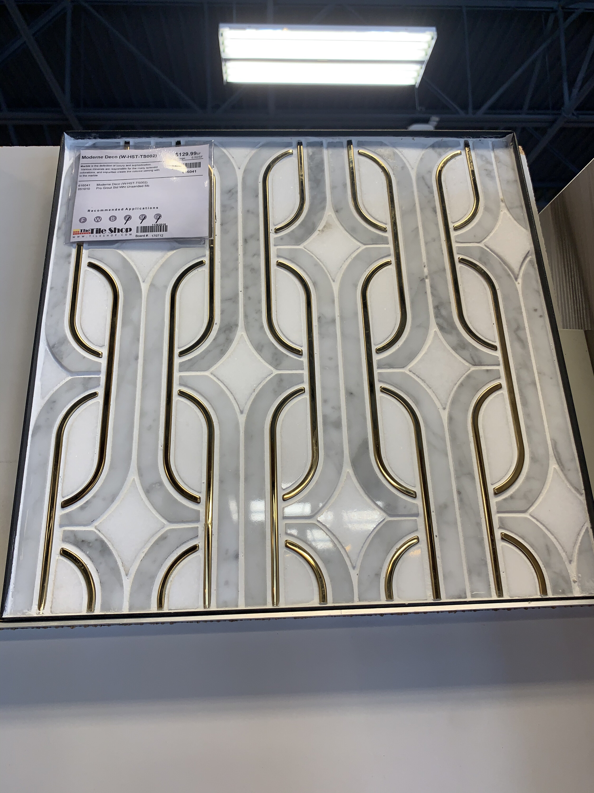
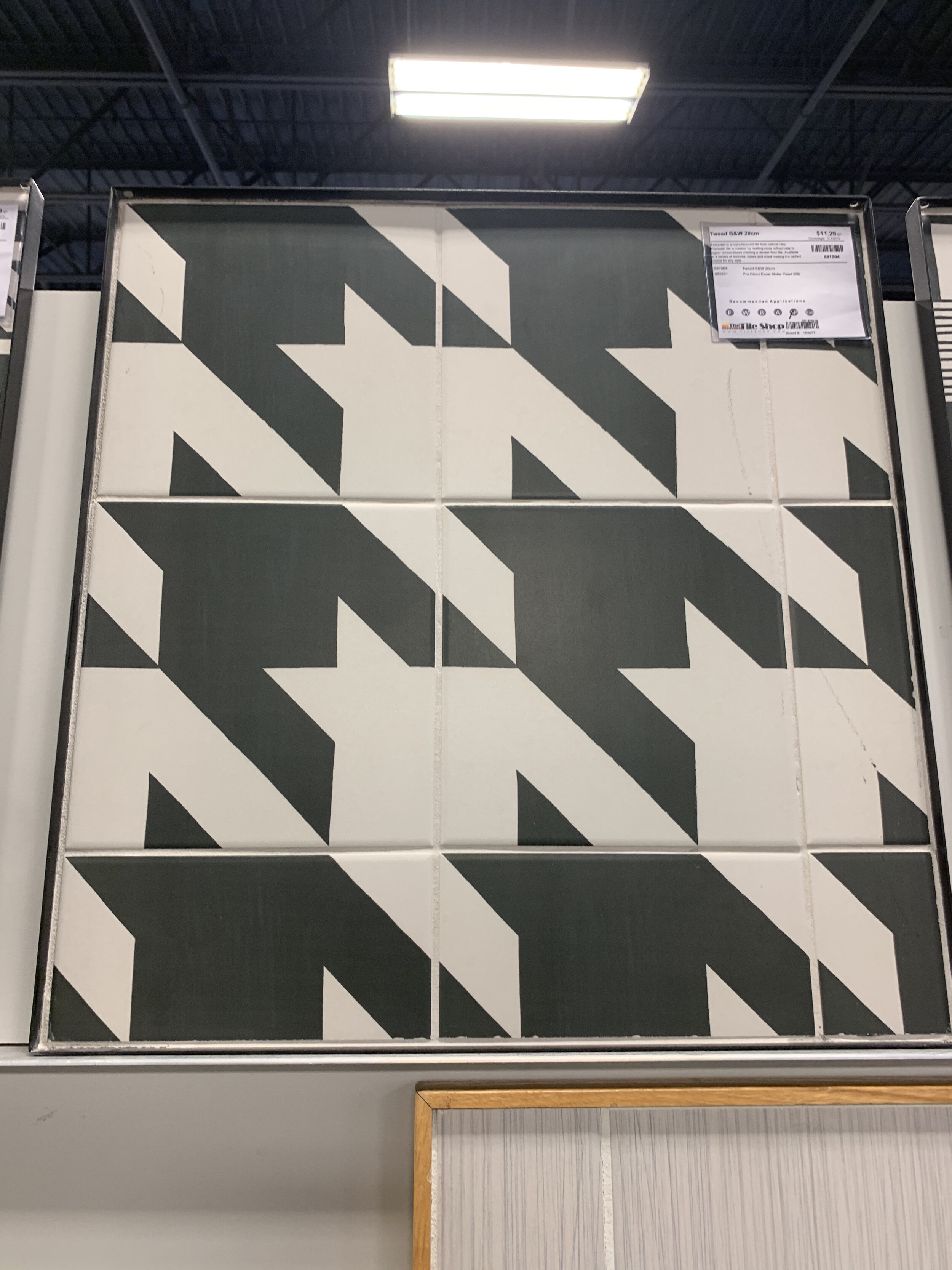
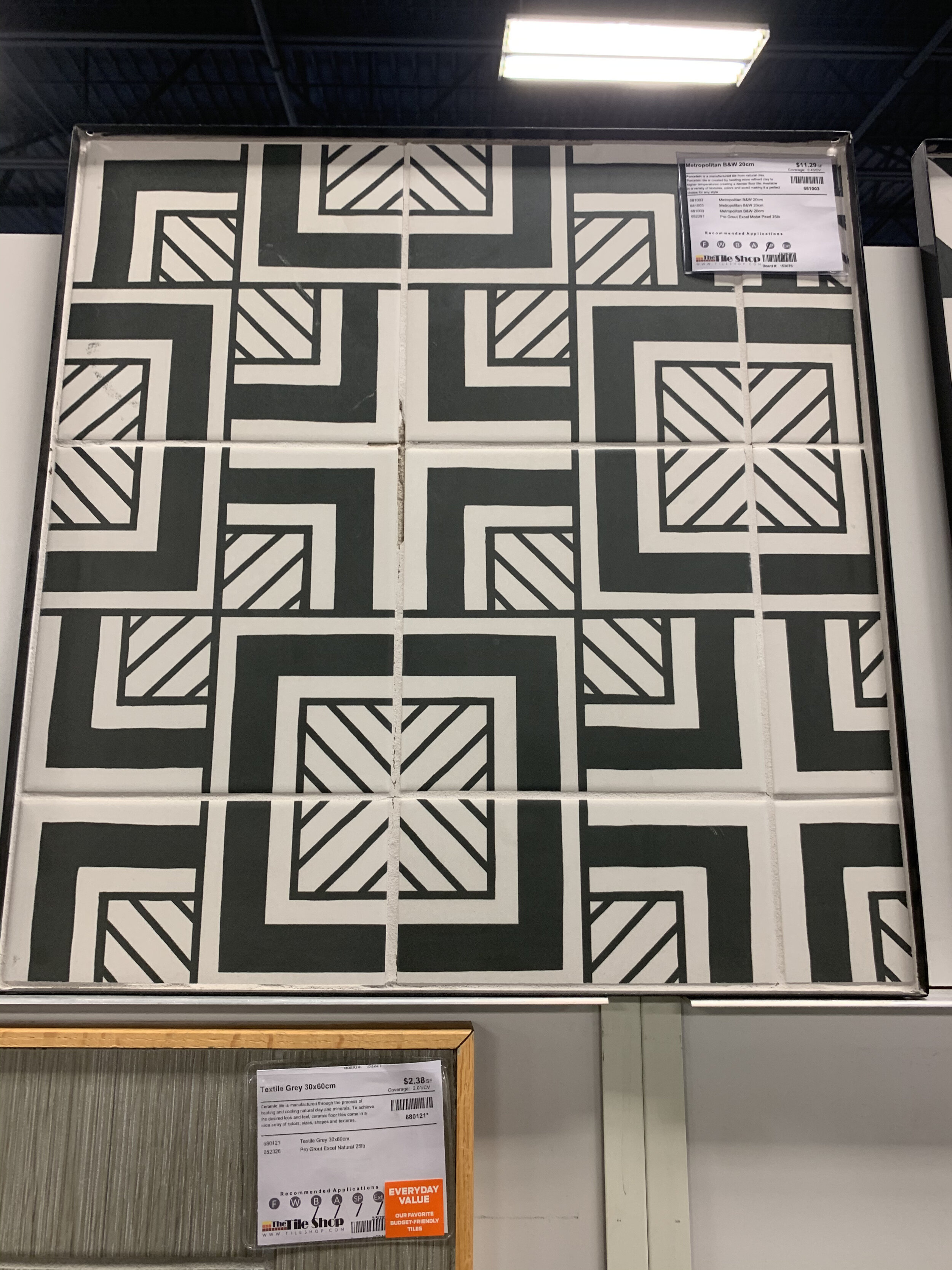
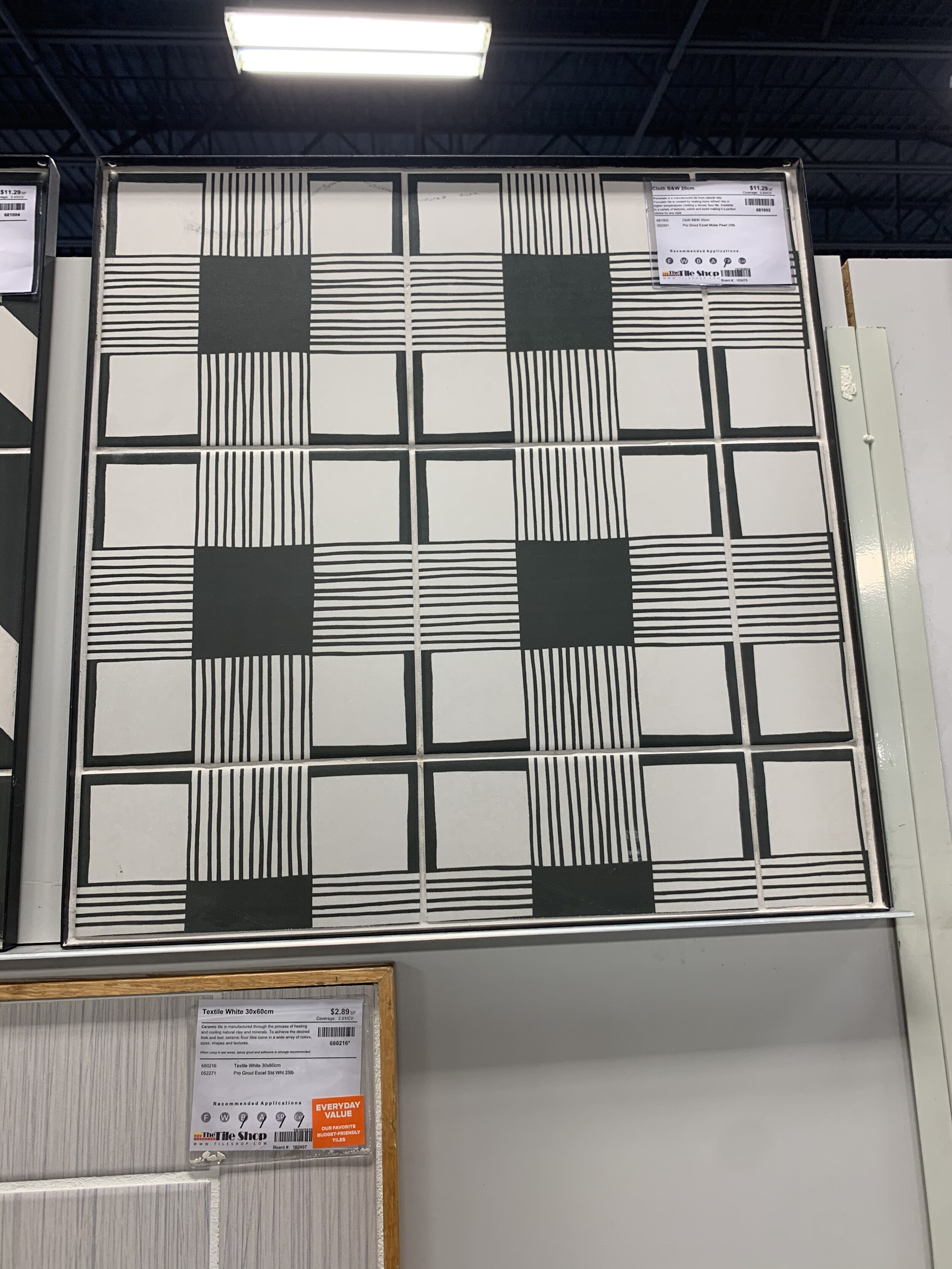
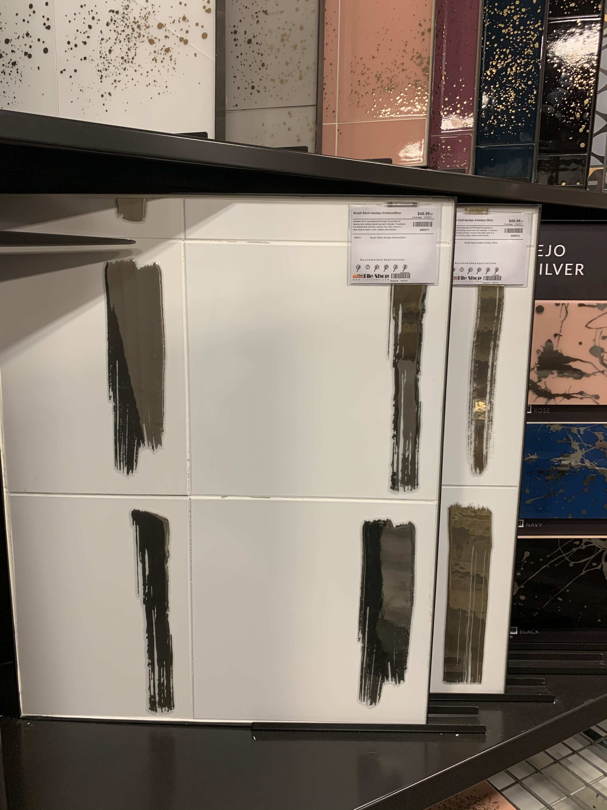
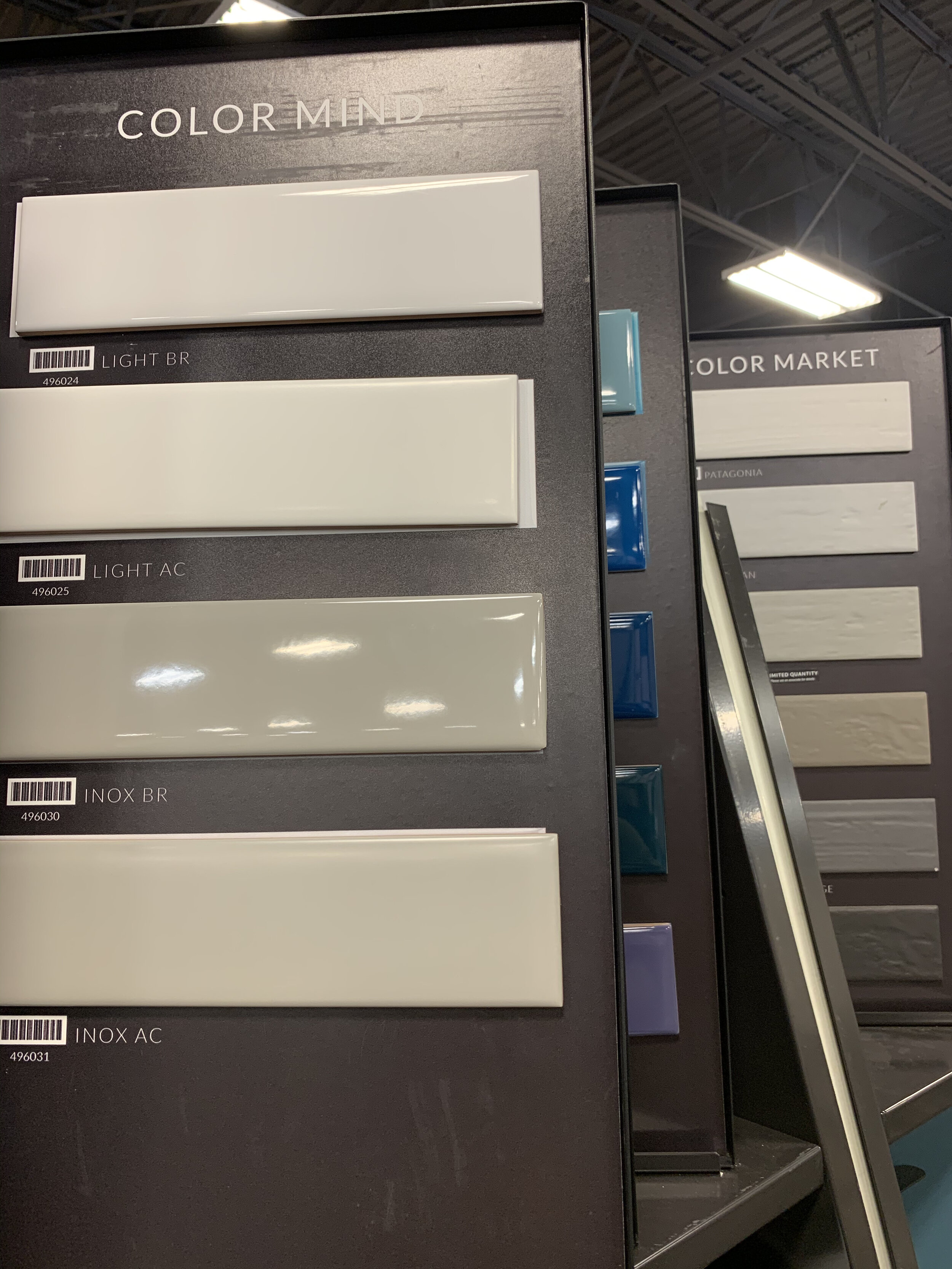
While any these would have been beautiful, I didn’t want anything too graphic. There are so many elements in designing a kitchen and everything can’t be the star. For me, the black cabinets will be the star and the tile is the supporting actress. I didn’t want you to turn the corner and the first thing you notice in my kitchen was the tile. And since I have an open concept floor plan (family, dining, kitchen) I have to consider the impact on all those spaces. I also didn’t want to repeat the subway tile I currently have in the kitchen. So here is what I came up with:

Tile simulator imagine via The Tile Shop
I love that this design was clean, simple and modern. I had to modify it a bit since I don’t have the room for such long subway tile, here is what I used came up with instead. I took a classic herringbone tile and turned it for a more modern layout - a diagonal herringbone is what the direction is called. This achieves the look I wanted in the simulator but at the right scale. To highlight the pattern, I’m using a whisper gray gout, which will pick up the gray in the quartz countertop.


At home with the tile.
KITCHEN LIGHTING
Brass elements will be seen throughout the kitchen with the faucet, cabinet knobs/pulls, counter stools and ultimately lighting. Thanks to sponsors Hudson Valley Lighting, the Broomley by Corbet Lighting will shine over our new black sink and brass faucet.

Small in scale but big in detail, Broomley is a combination of ’70s streamline design with mid-century mixed mediums. Solid brass given a weathered vintage finish and an opal white glass diffuser merge in a simplified form, conveying the high style of that age.
EAT-IN AREA
This area has changed very little since we moved in 14 years ago. The current pendant is from my inventory and used to be in our primary bedroom. It was changed about a year ago but I knew it was temporary because I didn’t love it in here, it just provided better lighting then we had before.
We brought our black wood table with us from our apartment in Boston back when I was heavy into Pottery Barn. It’s a classic table and has been extremely well loved. I’ve wanted to replace it before but Daren had sentimental feelings about it. Since our cabinets are going to be black, I didn’t want a black dining table. I mean I love black, but that’s just too much.

Current dining table, chairs and lighting
Next are the chairs, which will be a controversial topic I’m sure. I get so many compliments on my dining chairs and offers to purchase them, well now is your chance! I will be replacing the popular vintage chairs upholstered in a leopard. They are really comfortable and well cared for, I think I’m going to keep the head chairs and just sell the 4 side chairs (still deciding). I want something with a lower sight line to the kitchen. Our current chairs have a high back and are great for long dinner conversations (we’ve had many) but I’m hoping to find something as comfortable with a shorter back.
Now for the rug, we need a new one period. Our current rug is at least 10 years old and use to be our living room rug. I was drawn to it because I love modern florals and still do, but this not the direction I’m going - so it’s going. I want something modern with some color and pattern.
LIGHTING
The star of the show in the eat-in dining area will be the Hexsation Pendant from Hudson Valley designed by Martyn Lawrence Bullard for Corbett Lighting. All of the numerous clear glass panels have a ribbed texture to maximize light diffusion, and the hexagonal shapes are emphasized a vintage brass outline of the Brass frame. It’s modern and has an Art Deco-inspired feel and warmth which is exactly what I was looking for the dining room. It also plays nicely with the Broomley pendant over the sink in the kitchen. And bonus I don’t have to install a dimmer switch as planned.

Hexsation Pendant by Corbett Lighting
I also reached out to my friends at Caracole and they were kind enough to sponsor the Cullinary Circle Dining Table. I fell in love with the radial-matched eucalyptus pattern highlighted with a Dappled Mink finish and the Mother of Pearl inlay. We will be going from an oval dining table to a round one and I’m so excited, plus it’s a perfect compliment to the black cabinets. The Art Deco-inspired pedestal plays with the Art Deco feel of the Hexastion Pendant that will hang above the table.

Caracole Culinary Circle Dining Table
As I mentioned before, I wanted a lower profile chair that felt more open and the Quinn Arm Chair from my new friends at Universal Furniture were perfect compliment to the dining table. They were so kind to sponsor a set of 6 chairs to complete our dining room look. The have a generous seat and the high arms make them extraordinarily comfortable for long dinner conversations.

Universal Furniture Quinn Arm Chair
With an open concept family, dining and kitchen, I wanted a rug for the dining room that picked up the color in the painting over the fireplace. So I reached out to my friends at Surya and they sponsored the perfect rug for the room. Notice the black and white stripe too!

Emma by Surya
Last but not least, I will be using Calico Bogolan - Crypton Home - Obsidian on my waterfall benches. This fabric helps tie in all the patterns together and it is Crypton! We use these benches daily to take off shoes, place bags and everything else so knowing they will now be easy to clean is awesome!!!

Calico Corners Bogolan - Crypton Home - Obsidian fabric
- DESIGN PLANS -


The Week Ahead: old countertops will be removed and replaced our old backsplash will be removed the following week.
As you can see it takes a village, and I’m so thankful for all the brands sponsorships that are helping me pull off these rooms. Let’s see what my designer friends are up to with their spaces:
At Home With Ashley | Banyan Bridges | Bari J. Ackerman | Brit Arnesen
Brownstone Boys| Cass Makes Home | Dominique Gebru | Gray Space Interiors| Haneen's Haven
Home Ec. | Nile Johnson Design | Pennies for a fortune | Prepford Wife | Rachel Moriarty Interiors
Sachi Lord | Susan Hill Interior Design | This Is Simplicite | Tiffany DeLangie | Victoria Lee Jones